


I’ve always really loved prints and paintings that use bold letters and words in their compositions. From Barbara Kruger to On Kawara, I seem to have an affinity for fine artists who add flair to their work with writing. I think it all began when I first saw Rene Magritte’s, The Treachery of Images. The moment I saw that painting I knew that I was completely in love. The way words and phrases can take on a whole new life when they’re carefully integrated into artwork is amazing, and the end result often is a more challenging and meaningful image.
Based on this background, you can imagine my surprise when I found this delightful print by  Mike Monteiro on the 20 x 200 gallery’s website. To me it was perfect… Quirky phrase—check; words as a central focus of the composition—check; cool black background reminiscent of Malevich and On Kawara—check; and with a message that I can personally relate to! I had to have it and luckily I got it and for 20% off! I actually just bought one of the last two prints a moment ago. I am trying to write this blog as fast as possible so that you can quickly take advantage of the sale before it ends.
 Mike Monteiro on the 20 x 200 gallery’s website. To me it was perfect… Quirky phrase—check; words as a central focus of the composition—check; cool black background reminiscent of Malevich and On Kawara—check; and with a message that I can personally relate to! I had to have it and luckily I got it and for 20% off! I actually just bought one of the last two prints a moment ago. I am trying to write this blog as fast as possible so that you can quickly take advantage of the sale before it ends.
Although the 20 x 200 Gallery is actually headquartered in New York, the gallery mostly relies on their website to sell prints. The result is an easily navigable site that provides good work from talented artists for a reasonable price. Please take a moment to look at their website, your walls will thank you. J 20 x 200 can be found at: http://www.20x200.com/ The following prints are a few of my picks:
Because as I mentioned, I love words, I can't help but be attracted to this one by Shaun Suudholm.

Because using bright colors and having a pop art aesthetic is awesome I loved Trash Mountain by Megan Whitmarsh

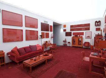
And last, because this walks the fine line between creepy and hilarious, I adored The Office by Rebecca Loyche


2 comments:
Matilda-this blog looks amazing. I have really enjoyed all your post.
I really like this one:
Vanity Fair MAY08:pg269 (and, incredibly, looking not a day older)
I loved the explanation of how they are made. :)
Post a Comment